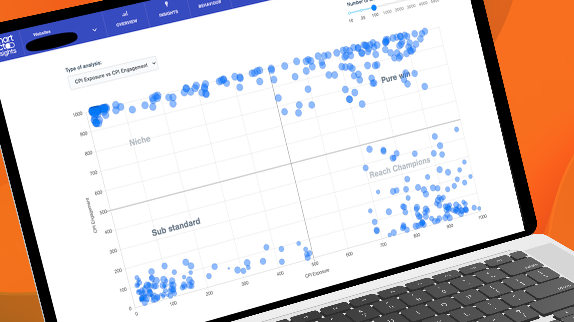
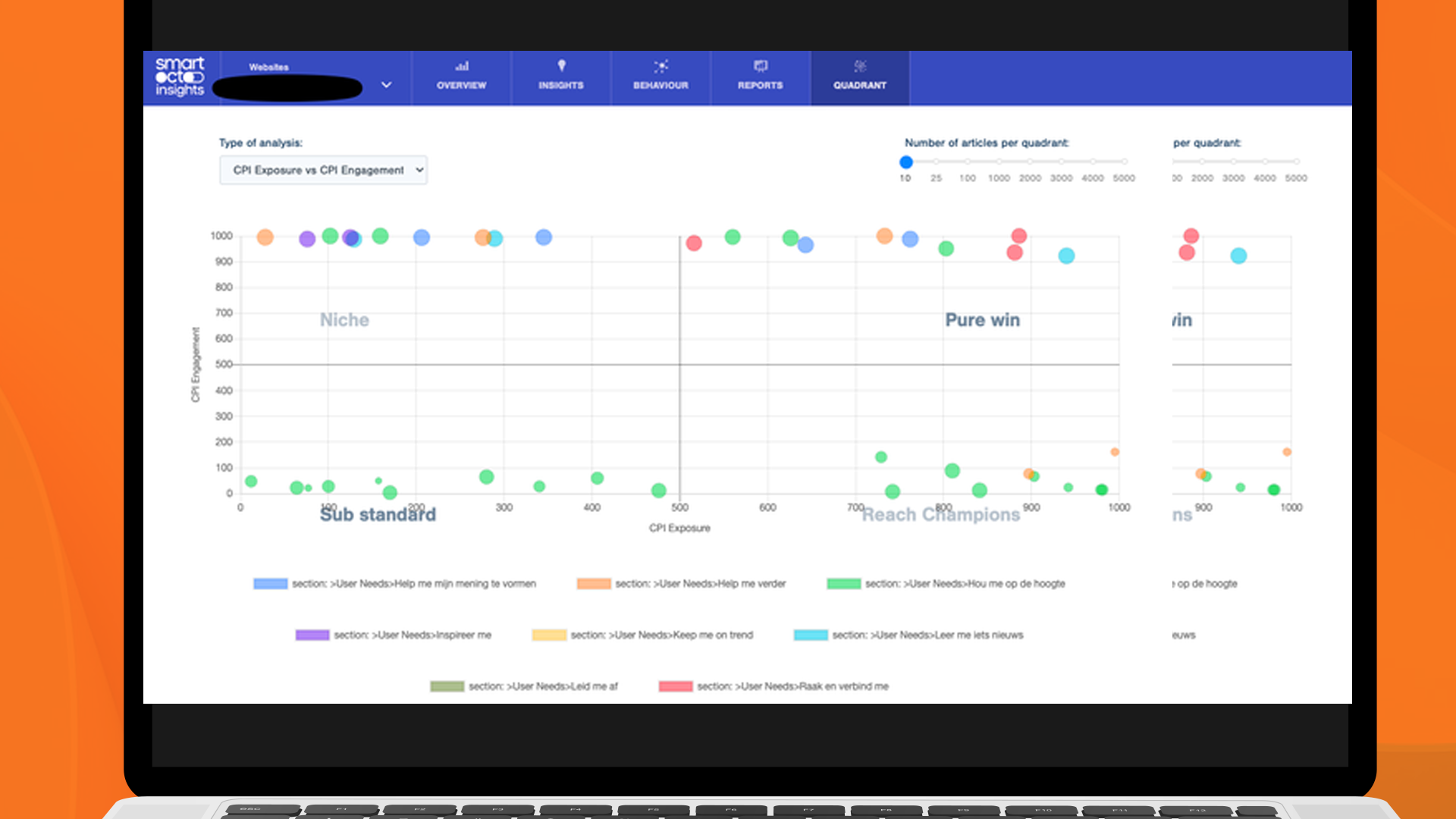
The Quadrant Model of Content Optimisation gives an easy overview of what kind of stories work for your audience and what stories need adjustments. The ultimate conclusion could be that you need to skip the stories that don't perform at all.

As much as we think that every story can be optimised, we also believe that making hard choices about the number of articles that are being published can be the start of a very effective content strategy. With the Quadrant Model, we offer insights that help to make those choices. They are very helpful for your advertisement or subscription strategy.

Watch our webinar about The Quadrant Model

In this case, you can see the performance of articles (the dots) on exposure and engagement. The place they take in the quadrant, tells you what kind of articles need action.

On one axis we might put reach and on the other engagement. With that, you get an interesting overview of topics (or even stories) that have an impact on your audience (top right) or the ones that don’t (bottom left).

The core issue? The top half of the right quadrant articles convert to 20 times more people than the average. Good niche articles need to get more distribution. Reach champions need enrichment. At the same time, stop doing stuff in the bottom left.

The user experience is intuitive. If you click on any dot in the quadrant for example, you’ll find further details and insights about that article.

Dragutin Miletić

Dragutin Miletic co-founder and CTO @ smartocto

The Quadrant Model is basically a visualisation of the page performance indicated by smartocto Insights. It gives editors a view of what works for their audience and what does not.

Belgium publisher DPG Media uses a quadrant Model for strategic reasons. Their goal is to convert more visitors to a premium membership. We at smartocto were inspired by the joint collaboration on this subject and created a more generic version of the Quadrant Model.

  • There’s a sliding scale to enable you to include fewer or more articles in the analysis. So, you might elect to see just 10 in each quadrant, or hundreds. As to how these are selected, it’s done by most extreme to highlight outliers. Necessarily the further down this list you go, the more likely you are to see dots appearing in the middle of the quadrant.
  • The size of the balls on the diagram mean degree of loyalty. That’s the 1.0 version. This might change in the future. You could also arrange it so the size of the balls represents the number of articles of that type (be it organised by user need or topic etc).
  • You can see which authors bring the reach, who brings the loyalty.
  • You can click on a dot and drill down to see how that individual article is performing - and how it has performed.
  • You can filter on user needs, as seen below.
You can see that most of the time articles on the bottom left are 'Update me' stories.

While the user needs-centric content strategy is the base for successful digital publishing, the Quadrant model, introduced by smartocto, takes its content analysis and actionability in the newsrooms to the next level. The model applied to your output not only will always surprise and challenge you, it has the potential to inform and impact your product strategy, too. In digital publishing, content is product, and therefor the Quadrant Model is essential for effective, aligned and focused creativity.

Portrait of Dmitry Shishkin

Dmitry Shishkin creator user needs model

watch the webinar recording