That breaking news story you published yesterday isn’t doing so well on our Content Performance Indicator. Here’s what to do…
Effective ways to improve the performance of breaking news
May 8, 2023 by Em Kuntze

What is CPI, anyway?
Our Content Performance Indicator is our compound metric that allows you to see how content has performed over a period of time by calculating a score between 0 and 1000. 500 is the average point for your newsroom, so anything higher than this is good, anything below it… not so much. CPI can be calculated for Engagement, Loyalty, and Exposure (as well as overall). When content is popular with visitors who read articles on your site as part of their routine, and find them engaging most of the time, that will positively affect the CPI for Loyalty. Reading articles till the end can be reflected in higher Engagement CPI. By the way… CPI can be applied to your website's articles, authors, topics, or sections.
Download our format card for advice related to breaking news.
1. Understand why people read breaking news
Breaking news stories tend to score well on Exposure. This is logical: they’re likely pushed hard and shared to social media. There’s not necessarily much to improve here. Of the three CPI types, it’s Engagement that’s worth paying attention to if you want to up those results.

Miloš Stanić Sales and strategy @ smartocto
If you’re looking to improve the performance of these articles, it’s useful to think of what user need breaking news stories fulfil. Typically, this is ‘Update me’, and there are two things to bear in mind about this:
- ‘Update me’ stories do what they say
‘Update me’ stories are usually breaking news events, typified by being short in length and often conveying hard news. It’s in their nature to be transitionary or fleeting.
- Think of ‘Update me’ stories as ‘developing’ - and don’t orphan them
If the story is big enough, keeping on top of developments can be a useful way to build authority and keep readers interested and engaged. Of course, that’s not always possible, and many breaking news stories run the risk of becoming - as our CMO puts it - ‘orphans’.
-> Check out this fishy tale for a real-world example of ‘orphaning’ content
2. Use your [analytics] toolbox
Page Depth
[a metric showing how many additional pages were opened after the reader clicked on the first page - useful for seeing how long readers stayed on site and how much their curiosity was piqued by your content]
It’s likely that breaking news stories will require context, explanation and perspective, Miloš Stanić says. "This is why ensuring that you have lots of related content on hand is vital. Allow your readers the opportunity to browse and explore topics - and make sure that you have enough of those user needs covered to allow them to do so. Placing links in the text to other user needs stories on the same topic will help with Page Depth scores - and therefore boost CPI Engagement."
If there’s a breaking news event about, for example, a forest fire this might mean creating a portfolio of content that:
- Educates readers about the reasons and causes of wildfires
-> How to write an ‘Educate me’ piece
- Provides sufficient information to enable them to Connect with organisations that are helping relief efforts
-> How to write a ‘Connect me’ piece
- Interviews experts to give readers a sense of context or Perspective
-> How to write a ‘Give me perspective’ piece
- Present case studies or examples of successful intervention or management to negate negative feeling and Inspire
-> How to write an ‘Inspire me’ piece
3. Enrich your content
In smartocto’s Insights tool there’s a great visualisation called the Quadrant Model. Two outcomes are plotted on both axes (usually engagement and exposure) and content is placed accordingly in this matrix. Articles scoring highly on both fronts appear in the top right quadrant; content failing in both on the bottom left. What you’ll typically find with breaking news is that it does ok with exposure and less well in engagement, appearing somewhere around the bottom right.
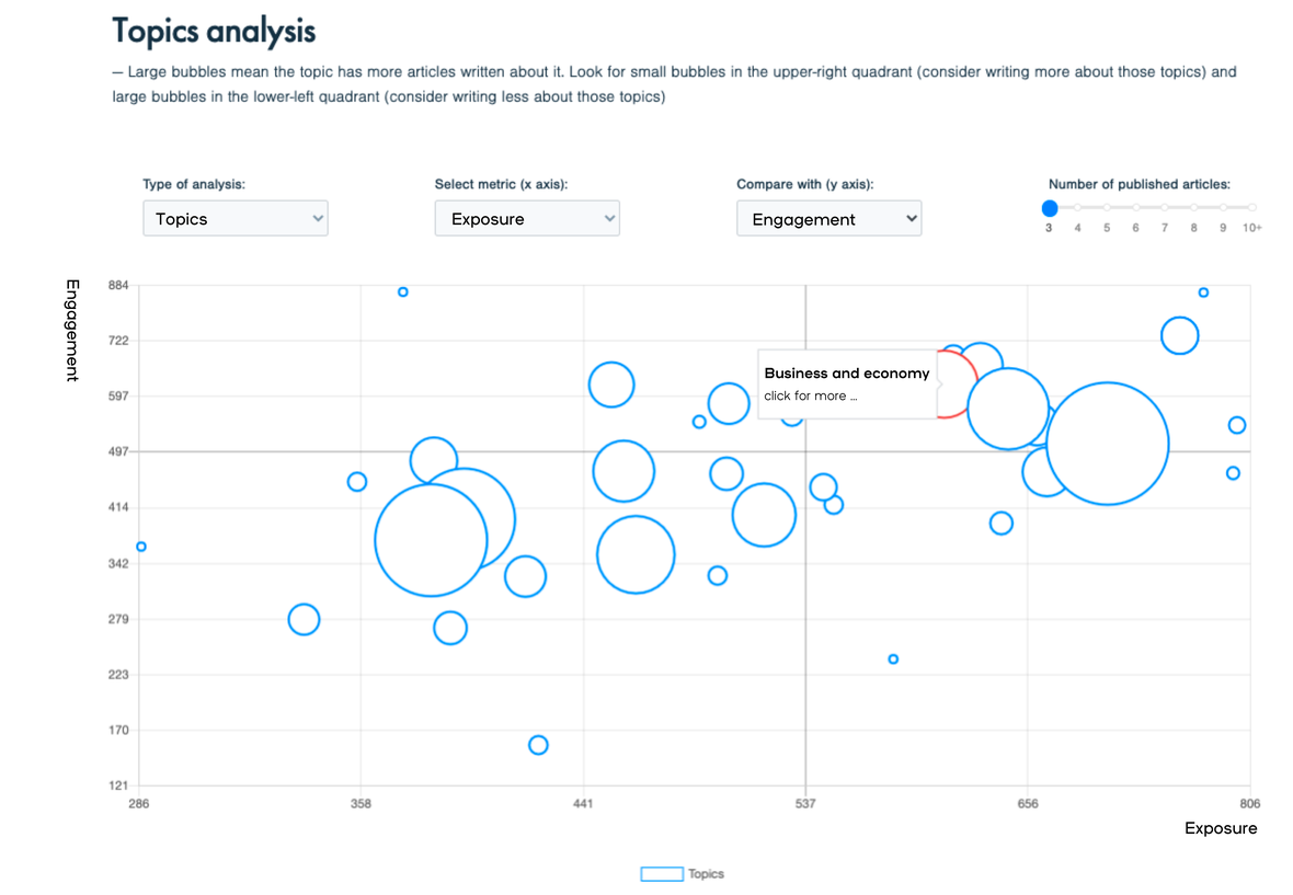
Very simply, those ‘Reach Champions’ almost always benefit from additional enrichment, through things like videos or visuals. If your article features neither, it might be something to consider one of the following things:
- Add a video. For example, if a fire breaks out, immediately search for videos on social media. Even if it's just a smoke plume from 2 kilometres away - it still says something about the size of the fire. Make sure you check that the video is definitely related to the event you are reporting on.
- Include a map in the article. This is only possible with breaking news about a sudden event, but it happens relatively often. A map helps readers orient themselves. It's very factual information, but it will definitely help increase engagement.
- Collect and present reactions to the news event. This immediately gives the article a personal character, allowing the reader to identify with the emotions that arise during breaking news. In our news needs model, we call this 'Keep me engaged'. A collection of relevant tweets can be enough. Also, do a round of calls to official channels.
- Bonus tip: adjust the headline and introduction if the article has been enriched, or show that the article is still being updated. Two examples:
- "BOMB EXPLODES IN CENTRAL JAKARTA" >>> "DEATH TOLL RISES IN BOMB ATTACK IN JAKARTA"
- "BIDEN RECEIVES MOST VOTES IN ARIZONA" >>> "BIDEN MAKES SIGNIFICANT STRIDES IN INTENSE BATTLE FOR US ELECTIONS"
4. Check your formats
That leads us nicely to the question of formats.
The problem with breaking news is that it comes to most of us organically. It’s therefore really important that fundamentals - headlines, images, lead-ins - are sharp and on-point. We’re producing handy format cards for reference and you can download the breaking news one. ↓
download format card
5. Do some further reading
Make sure your content distribution is in order.
- A blog article about why ‘Update me’ articles shouldn’t be demonised
- Our whitepaper, setting you up for success with user needs
- Watch this webinar back to understand the User Needs Model more completely
And you can ask us how we can help you improve the performance of any story based on solid data analysis.
You may also like...
Regional broadcasters seek change in workflow
Measure your success in 3 simple steps