You can’t manage what you don’t measure - that’s an adage as old as the hills. But, despite its vintage, it’s a sentiment that still needs reinforcing. It doesn’t need to be arduous - here’s what you need to know to perform a quick ‘success’ audit.

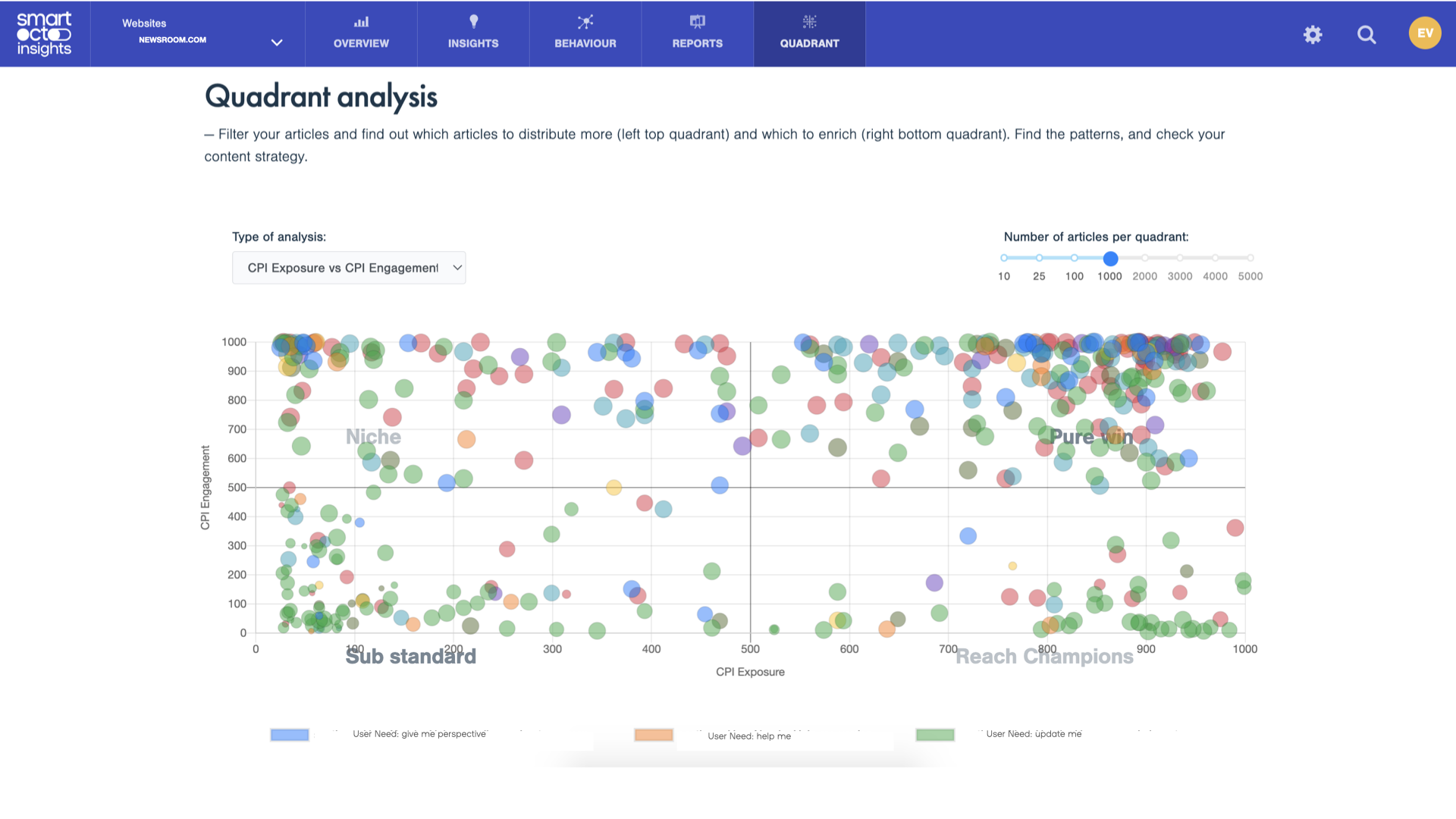
The hard truth is that, whatever success metric you use, a third of your content should never have been produced. Across all brands, in all places, 30-35% of articles massively underperform, our datateam discovered.

There’s a fairly simple response or action to this realisation: identify those deadweight articles and redirect the time and energy spent creating them into stuff that actually adds value to your brand instead.

When we’re asked about how to optimise content, we suggest something obvious first. These suggestions are not ultra-specific, they’re not particularly detailed, and they’re not even revolutionary, but they are solid. What’s more, this simple flow is something you can use right now to audit your output.

  1. What does online success look like?
  2. Do your articles miss this mark?
  3. If they do, what are you going to do about it?

Everybody’s idea of success is different

Defining success

Engagement? ROI? Subscriptions? Low churn? Page views? What does success mean for you? If you asked everyone at your company - or even in your team - would they give the same answer?

Everybody’s idea of success is different. And it should be. A niche publication about expat life has different goals to an established legacy brand.

Brand A

Special interest publication, recent startup, membership model

Success = building awareness (particularly if it’s a new brand), which can be tracked via reach metrics. Boosting growing audience loyalty (including increased engagement) and increasing paid subscribers.

Brand B

Publicly funded regional news publication

Success = improving social and societal impact: growing a more diverse follow base; improving relevance among its readership.

Brand C

Commercial brand with high-profile national titles

Success = improving conversion rates, online subscriptions and paywall optimisation.

How’s your stuff doing? (some tools to help)

Working out if your output is outstanding is much, much easier when you know what ‘outstanding’ actually looks like. It’s likely you’ll have been keeping an eye on performance anyway, but with a clarity of purpose and focus, this should become more purposeful - and efficacious.

Dashboards

Ensure the information you need is easily accessible. What works for one newsroom may not work for another - use your success metrics as a guide when you set up how data is presented to you.

-> Read this use case from Montenegro’s Vijesti about how they made the shift to a more data-informed approach

Quadrant Model

A really simple way to visualise what’s working, and what’s not is with the Quadrant Model of Content Optimisation. Typically, we put reach and engagement on the two axes and plot performance of articles in this grid: those appearing in the top right are those ‘big win’ pieces that score well on all fronts.

-> Learn more about this here.

Goals

These are progress reports that enable you to see what’s working now and how close you are to getting where you need to be. This can give you a boost when things are going well, but also alert you when things aren’t progressing as they should.

Do you want to learn more about the smartocto features? Please get in touch.

That pesky 30% - optimising your output

You’ve identified your ‘mark’ - what success looks like to you. You’ve also looked at how your articles are performing. But if your content misses that mark, what are you going to do about it?

Notifications based on your own KPIs

Actionable notifications are next level. Data’s great, but it’s what you do with it that matters - and sometimes that’s hard to ascertain. With notifications linked to your own KPIs, it’s easy to see what needs to be done to make your content work harder and do better. Ours talk to you in a language you understand because they’re linked to your strategy. We’ll always get the interesting biscuits out of the data-jar and help you make the right decisions.

->Watch our webinar about smart notifications here.

User Needs

If in doubt, go back to the audience.

You’ll have seen the benefit of using a quadrant model to check success already, but combine that with a user needs analysis, and you’re off. If you notice that your ‘no-go’ content consistently falls into the ‘Update me’ category, it’s probably time to address the logic for publishing articles like that. We’ve just published a whitepaper on this very subject, so if this is all sounding a bit confusing, stop what you’re doing immediately and go and read it. You’ll thank yourself later.

-> Check out our research about user needs here.

Quadrant analysis on the user needs
Here's the Quadrant Model of Content Optimisation with all the articles flagged by the need they meet.

In summation…

Sometimes the biggest shifts come from making simple changes. And often those simple changes belie the complexity of undertaking that task.

We know it’s competitive out there. That’s not going to change. The market will continue to get more specific as customers get more particular about what they want - and what they’re willing to pay for. What’s worked up until now isn’t likely to be adequate any longer.

We invite you to get ahead of the game and take those first steps towards making your business not just future proof, but a step ahead of the competition. Start with this checklist. Start today.