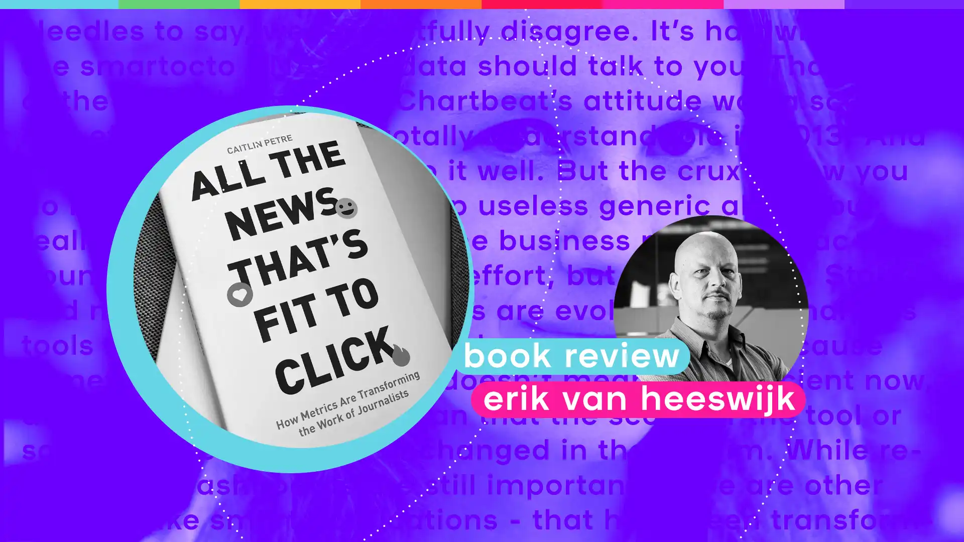
In the last ten years, the arrival of data in journalism has been much discussed. Countless conferences were flooded with impressive graphs and numbers, but the volume of academic research on the organisational part of dashboards in the newsroom has stayed pretty low. So, I was pleasantly surprised when I learnt about the 2022 book "All the news that is fit to click" by Caitlin Petre from Rutgers University.

Petre investigated the production process of the editorial analytics tool Chartbeat, and took a look at the introduction of the system to the newsrooms of the New York Times and Gawker. I will be upfront about it: I am critical of the research and the conclusions. But it is great that Petre recognised the need for academic rigour, and there is much to learn from clarifying assumptions. So, let's compare notes.

In order to learn more about the introduction of the Chartbeat dashboard, Petre rightly concluded that field work was crucial. Over the course of 2013 and 2014 she was a fly on the wall of the newsroom of Gawker and the office of Chartbeat for a couple of months, and she conducted 74 interviews on Gawker, Chartbeat and the New York Times between 2011 and 2015.

I think most of the positive and negative things about the book are encapsulated in this setting. Her descriptions of the day to day operations feel vivid and human, you can clearly tell she had secured a central desk in the working spaces and was permitted to take great notes. But I was a bit shocked about the timeline and the scope of the operation. The world of editorial analytics changes significantly every year, and to base far-reaching conclusions on 8 year old data seems to point to a lack of recognition of that fact. Newsrooms have moved on considerably since 2013 - and analytics as well.

Also, while I understand that every research must be based on a sample, taking the New York inhabitants Chartbeat, Gawker and the New York times as your only cases is fraught with risk. Gawker was one of the most data-driven editorial teams in the world, the New York Times arguably the most prominent journalistic organisations in history. Neither are even remotely representative of the average media team, and it does lead the book to strange places.

The last wobbly pillar is Petre’s own extreme theoretical framework. She begins the book with explaining Taylor and Braverman’s theories of measuring and management. To paraphrase, connecting a stopwatch to employee activity is meant to chop work into simple tasks and to make it more efficient. She posits that it deskills the workforce and by doing so, gives management more power and control over the workflow and the end result. Petre writes:

"Like a manager standing over the assembly line with a stopwatch, Chartbeat and its ilk now hover over the newsroom."

While Petre adds a bit of nuance later, you cannot escape the feeling that this is almost Marxist power struggle lens through which she observes reality. That’s why Chartbeat is described as tricking journalists into believing that they are not really being optimised and that their gut feeling is substantiated by data. It must befriend them in order to function as a managerial system without leading to revolt.

It is certainly true that in order to be relevant, a software solution has to take the user experience and expectations seriously. And of course data plays a prominent role in digital transformation and is therefore a factor in change management and HR processes. But data does not turn journalists into factory workers. The extreme framing of Petre seems frankly just outdated.

Data does not turn journalists into factory workers

So much for the methodology of the book; it is more rewarding to discuss some of the observations of the field work. First of all, it is noticeable how the current use of analytics has matured since 2013. Petre almost exclusively talks about tactics involving Chartbeat’s reach metrics - pageviews, visitors - while 2022 shows lots of workflows based on reading time, conversions, engagement or value.

What is really absent from the book is the fact that the relationship between content strategy and KPIs is more layered and certainly goes way beyond measuring just the reach of news articles.

I think it’s here that Petre does the greatest disservice to journalism.

In any good newsroom there will be articles that are meant to generate loyalty, conversions, engagement or brand awareness. In any of these cases reach is important, but for news brands for whom subscribers are an important part of their business model (everywhere outside the US), the analysis of data isn't one-dimensional. Sports articles behave differently than breaking news, long reads are a special breed, and various formats address different user needs. There is no one size fits all metric or tactic. While Petre writes that editors seem to identify editorial analytics with click bait strategies, she spends little time correcting that feeling.

Granted, data strategies have become much more sophisticated in the last few years. The ‘data destroys quality journalism’ narrative was probably a more widespread feeling in 2013 than today. But even then the researcher should have realised that you were looking at a skill set that was only 5 years old. Chartbeat didn't freeze or monopolise the analytics world, it was just a portion of phase one. At the end of the book Petre acknowledged that Chartbeat threw out a couple of these assumptions years later.

A point she does make well is how Chartbeat started to make metrics acceptable in the newsroom setting. Petre observes that Chartbeat has gone to great lengths to show editors that the numbers actually often reinforce the gut feeling that they already had. Or, if it is a tough truth that the tool is selling, they have been able to make the numbers look more magical and positive, maybe even a bit undefined ("meaning uncertainty" as Petre puts it) so everybody still has some wriggle room to create a narrative about success. A great example is the fact that if stories outperform even the top threshold on a given day, the visual representation of that success (here, a dial) breaks and won’t display the real number. While you could argue this is a real ‘off the charts’ moment and it is in some ways brilliant, reading this in 2022 from the smartocto HQ, it’s hard not to see the limitations and flaws.

We know that the user interface plays a huge role in people accepting a more data inspired culture, and in 2022 we’re beyond extremes: newsrooms need properly visualised, honest and transparent data because editors are more ready to accept that they can learn from data. Honesty and trust are two sides of the same coin. That’s what we do at smartocto - and we know that’s what works. We try to be straight shooters, but that is probably our Dutch-Serbian nature.
Honesty and trust are two sides of the same coin

The most interesting assumption to us is of course the fact that Chartbeat did not want to develop suggestions coming out of the data. To quote:

"The dashboard itself was also designed to perform deference to users' interpretative abilities and decision-making skills. During the development of the revamped dashboard, it was decided that the tool would not include algorithmically derived recommendations about which stories to cover, where to place them on the home pages, and when to publish them - even though the incorporation of such features might have helped client sites boost their traffic."

Needles to say, we respectfully disagree. It’s hardwired into the smartocto DNA that data should talk to you. That’s kind of the point. In fairness, Chartbeat’s attitude was a scalable and efficient one - and totally understandable in 2013. And granted, it is not easy to do it well. But the crux is how you do it: that you do not develop useless generic alerts, but really take the content and the business model into account. That takes a lot more effort, but it is worth it. Story and media business strategies are evolving - and analytics tools need to adapt to those changes also. Just because something worked in 2013, doesn’t mean it’s sufficient now, and certainly shouldn’t mean that the scope of the tool or software has remained unchanged in the interim. While reports and dashboards are still important, there are other things - like smart notifications - that have been transformative

How these notifications address the same cultural issues that Chartbeat deals with is a fascinating combination of technology, data science, UX and behavioural science. That’s something I promise to write about soon. Watch this space.