What were you looking for at this stage?
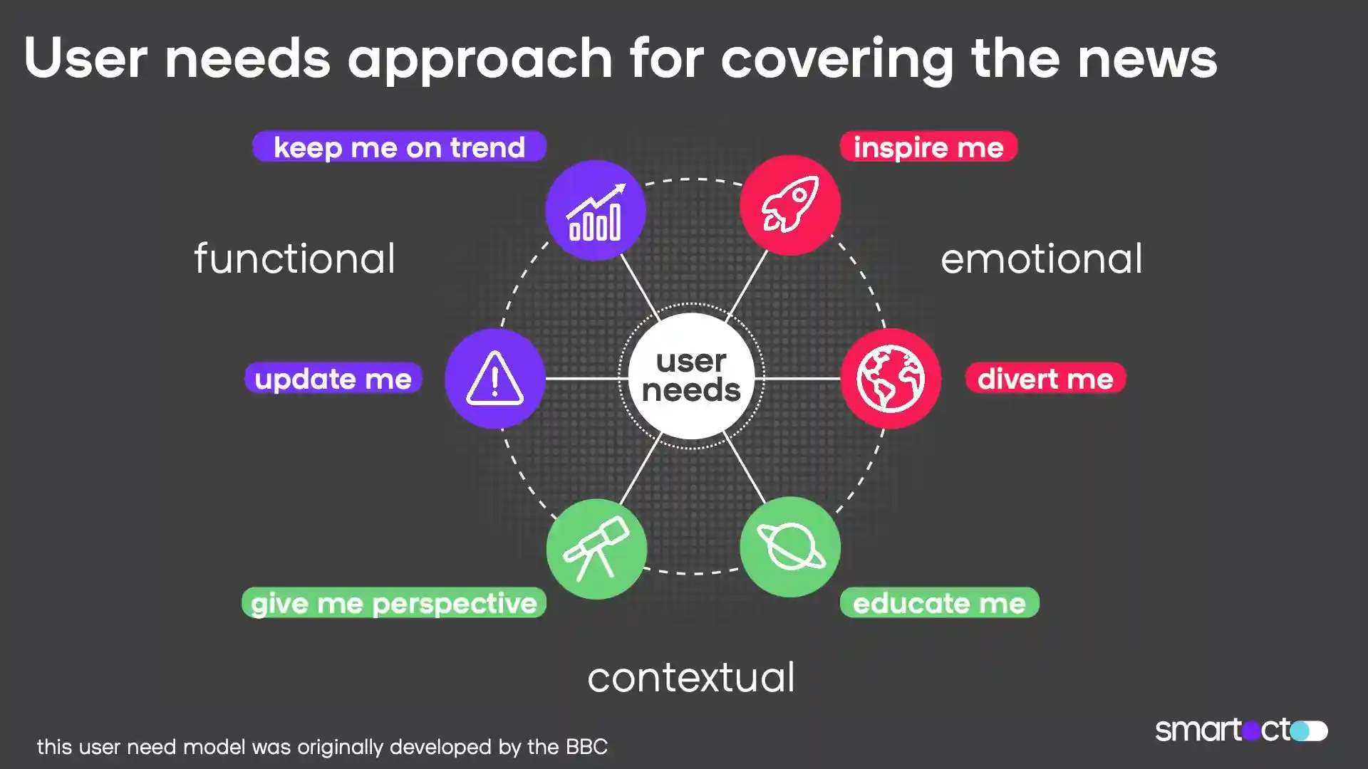
First it was a case of sorting content into the correct user need. But even this wasn’t without its problems. The reality of content is that a lot of the time, it doesn’t fall neatly into a single category - there will always be content that bridges multiple user needs, which makes it difficult to categorise, but that’s a reality that we have to be able to work with. Real life isn’t always neat.
How did you solve this problem?
We approached this problem by assigning each piece of content 5 points, and asked our team to distribute those points across the user needs they thought the article in question fulfilled. Initially we did this for 20-25 articles, independently of each other, and then merged the results.
As people who are familiar with the user needs framework, we thought it would be indicative of how easily this could be done. Generally the results showed shared beliefs, but in 15% of cases, different user needs were flagged - in most cases because of the multiple categories those articles sat in. That was still enough to keep us up at night.
What did you learn from that error rate?
It was an opportunity to check and test our findings - especially because we knew why those errors were being recorded. Bojana [one of the data team] took a sample of 30 articles from Omroep Brabant which were created after the user needs workshop and which fell into categories other than the ‘update me’ one, and then she tried to process the articles in a different way to check if the algorithm worked. With the exception of one article, all flagged correctly. And, that single inaccuracy was due to the fact that - once again - that article was flagged in multiple categories.
At this point we’d been working mostly with a semantical analysis - with the text and transcript of articles. This is fine if you can guarantee that a certain type of article is always going to be written in the same way, but of course in reality, that’s not always the case. If we prepared the algorithm for one client this way, it likely wouldn’t work for the next, so we had to work on a lexical approach as well. In the end we looked at something like 50 different features - things like number of words, verbs and nouns, whether or not there was a gallery or internal image, peoples names. So although the examples we were drawing on were semantic in scope, we ended up with something more recognisable as a lexical analysis.
You mentioned that 70% of content typically flags under the ‘update me’ user need. How do you work with what sounds like such an unbalanced data set?
You’re right, and one of the challenges here is in fact exactly the reason why this project is so important: we were working with severely imbalanced data sets. We had to use sampling techniques to address this.
And what about building the actual notifications?
Once we worked through that foundational set, we manually flagged 1 000 articles and trained the algorithm through those. I took a couple of weeks away from the office to focus solely on this, and without those day to day distractions, we produced something workable and accurate.
This foundational work was the determining factor in many ways: the mechanics of building the actual notification weren’t hugely dissimilar from our existing bank of notifications, so that part was quite a fun exercise.


