Hi there,
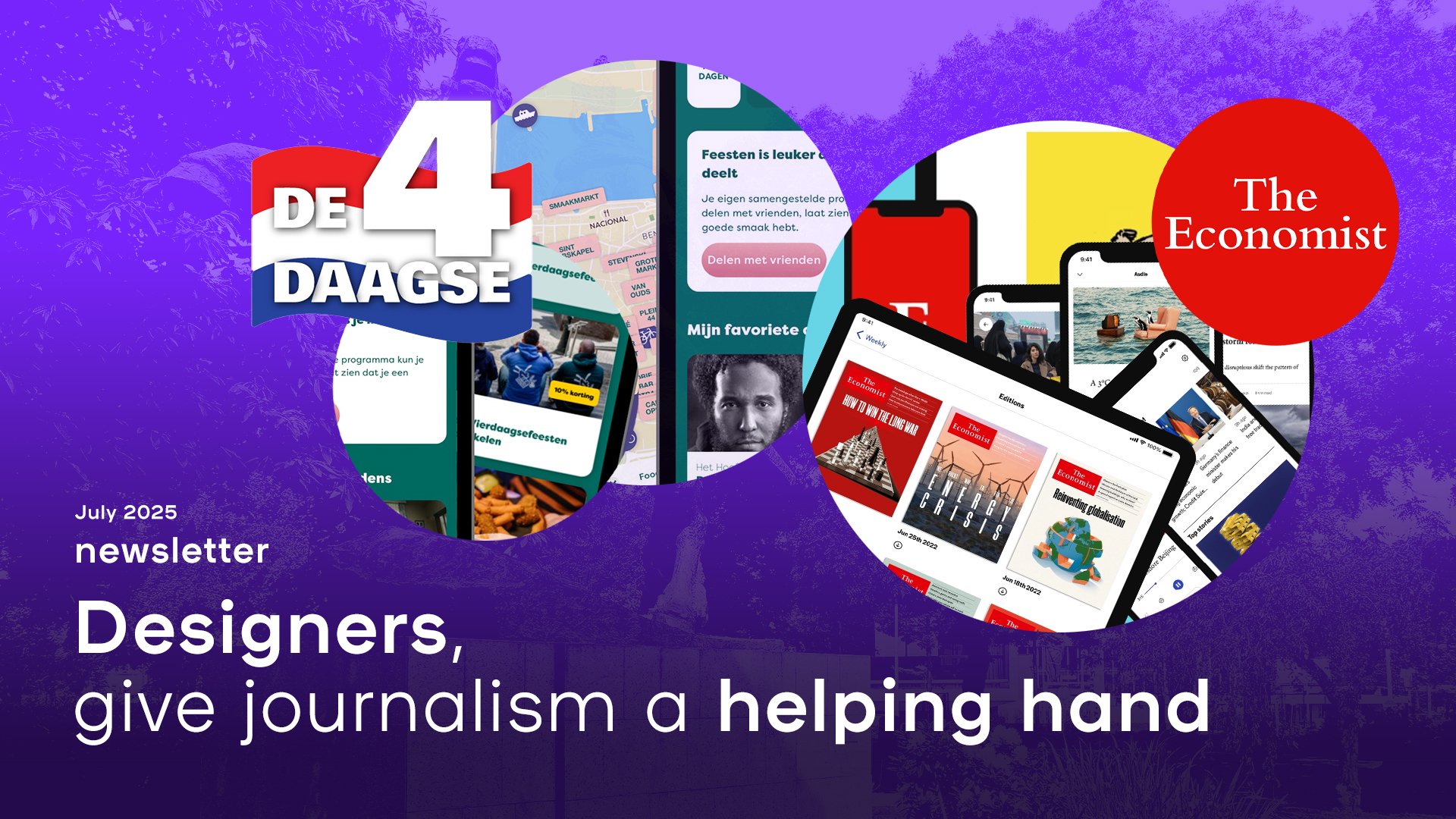
The summer festival ‘Vierdaagsefeesten’ is currently in full flow here in Nijmegen (the city where one of our offices is based). It’s one of Europe’s largest free music festivals, featuring over a thousand performances across forty stages and drawing in 1.5 million visitors over the course of a week. The festivities originated from the Four Days Marches - a long distance walk - in which both civilians and military personnel trek through the region.
Over the years, the event has grown more modern and sophisticated in its setup. There’s now an app that allows users to curate a personalised list of performances they’d like to attend. Fifteen minutes before each show, they receive a notification, and in some cases, warnings about overcrowded squares or parks. The app nudges users to share events with friends, and its interactive map lets you filter for vegetarian food or water refill stations, among other things.
This isn’t the only festival that’s harnessed the potential of apps to enhance its users’ experiences. Most festivals offer a version of this kind of service. The technology is, clearly, available and the party industry is continuing to innovate how it harnesses it.
So why aren’t most news apps?
Personalisation on homepages is still struggling to gain traction, and editors often have little control over the hierarchy of news stories.
The Economist recently launched a redesign of its app, introducing a key feature: it looks different during the week than it does at the weekend. On weekdays, shorter news items take centre stage, while weekends offer more space for long-form stories and background features.
It’s a smart move, but I believe news app developers could push things much further. In print newsrooms, editors often spend an entire day debating the layout of the front page. Which stories deserve a teaser with a big photo? Which headline should stand out more? Opinion pieces are styled differently from reports or analyses.
That level of nuance is almost entirely missing from the digital equivalent. Liveblogs sit side by side with news articles, opinion columns and reader comments. On social media, every preview looks exactly the same. It takes a trained eye to discern the differences in user need, tone or editorial style. And let’s be honest: people scroll past sports or lifestyle articles they’ll never read, every single day.
If you want to keep your app users engaged for the long haul, go out and find UX and UI designers who’ve earned their stripes in sectors like the party or events industry. And to those designers: please, give journalism a helping hand.
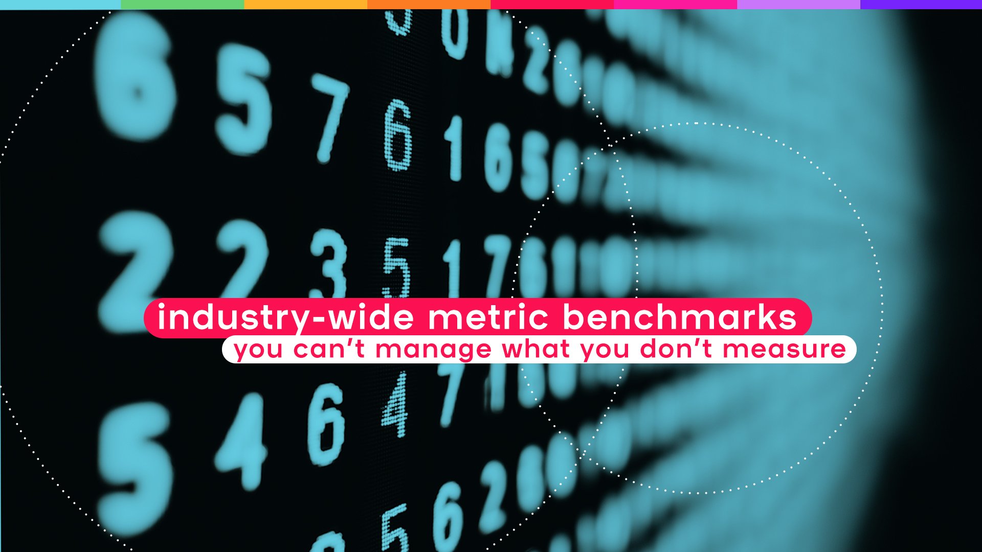
Useful industry-wide metric benchmarks
After this pep talk – if I may call it that – let’s bring things back down to earth with a blog about data.
We often get questions from clients wondering whether they’re doing well in certain areas. That’s why our labs team dug into the data from 231 brands to benchmark the following metrics:
- Page depth: the average number of articles visited during a reader’s session.
- Read depth: a compound metric that shows how far into an article a reader actually gets.
- Attention time: the time a user genuinely spends reading the content on a page. We only count ‘engaged time’.
Curious to know what the average (actually, median) looks like among our clients?