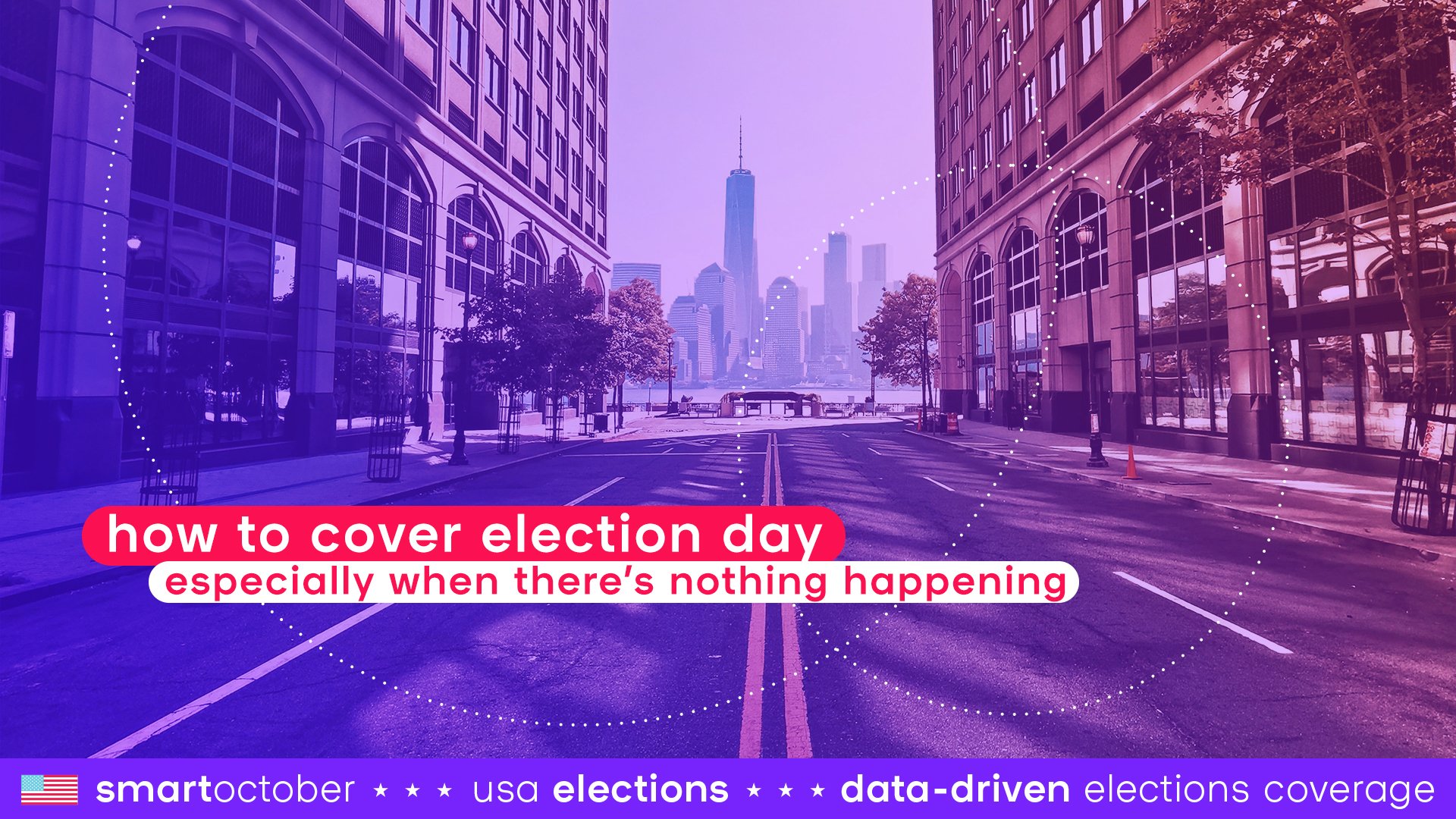
Where should the editorial focus be on election day, what essential questions need to be answered, and what format should the news be presented in? Read on for smartocto’s report on election coverage - and a helpful planning framework.

In the UK back in 2013, when rumours started to fly that a royal birth was imminent, journalists decamped outside the hospital where the Duchess of Cornwall was due to give birth.

There, at every news bulletin, the news anchor in the studio would ask the reporter in the field for updates.

There were no updates.

The BBC’s royal correspondent stationed outside said hospital, Simon McCoy, was visibly - and amusingly - irked by this:

"Well, plenty more to come from here of course. None of it news because that will come from Buckingham Palace. But that won't stop us."

Sometimes nothing happens. The problem is, everyone - you, your readers, the shareholders - expects something.

This week, we’re considering live coverage - and strategies to deploy to prevent a McCoy moment.

What we know about live blogging

The live blog has been around for at least 25 years. In the late 1990s, The Guardian started with minute-by-minute updates on sports, and sport continues to be an obvious and useful area to live blog about, not least because of the cost involved in watching them in person. People like to keep updated about the progress of games and matches and tournaments.

The popularity of live blogs coincided with the rise of Twitter, around the time of the 2008 financial crisis. "What’s happening?" was the question Twitter asked its users on what was then primarily considered a microblogging platform.

Newsrooms started to use live blogs to respond to the same question - and those questions weren’t just about football. They were created during major events such as earthquakes, rescue missions, significant court cases, or press conferences. For journalists skilled with Twitter, it became second nature. Yet it remained a challenge to write live updates while simultaneously conveying the essence (or context) of a story, which is, of course, the job of the journalist... We are more than just a conduit.

During the coronavirus pandemic, the COVID live blog became the most-read piece of the day on nearly all major sites, and since then, a live blog section has become a staple on many of the homepages that smartocto analyses. It essentially serves three purposes:

  1. Clustering information that, if published in too many separate articles, would overshadow other news.
  2. Conveying the urgency of a topic without the need to highlight it in every headline.
  3. Allowing a shift in tone of voice, sometimes more personal, and occasionally switching user needs - ranging from purely factual to a lighter approach.

These elements are, of course, ideally suited for election day. The BBC, The Guardian, and Sky News have previously told Press Gazette that live blogs are performing better than ever. Having at least one editor update the live blog full-time is a good idea for 5 November, and perhaps also for 4 and 6 November - at the Guardian they work in shifts to ensure round-the-clock coverage.

Great example of a liveblog:

This election liveblog of the NZ Herald in New Zealand (it’s rigorous, incorporates lots of different format types, loops in other commentary and sources - and the tone of voice is spot on)

Time for a quiz

Is your newsroom election-ready? This doesn’t just mean, ‘can you name the candidates?’ It’s really important to understand the story life cycle of your output. When you do, it’s easy to see where the gaps are - both operational and editorial.

<<<<QUIZ LINK>>>>

Updates for updates sake: is there an alternative?

Election coverage might often descend into horse race journalism, but this is where it pays to consider the data.

We asked our data scientists to conduct an analysis of articles published between January and September on the subject of the US election, group them by user need driver, and then analyse key engagement metrics.

This pattern might seem familiar now for anyone who’s been looking at user need analysis for any length of time, but it’s striking. Fact-driven articles massively underperform - especially when compared to those which settle in the context-driven axis. And look at those two (yes! Just two!) action-driven articles which are hugely paying their way.

It’s even more stark when you see the articles distribution visualised like this:

In a situation such as the one we find ourselves arriving in now, where an issue or event has been rumbling on for aeons, it’s really important to double down on what the audience needs of you.

Here’s what some of the key engagement metrics reveal:

We could draw all manner of conclusions from this, but here are three particularly interesting things this data study revealed:

  1. Context-driven content drives attention
  2. Fact-driven content might not perform as well, but it shouldn’t be neglected: it’s an important part of the reader journey, as evidenced by its page depth figures (i.e., the number of additional pages the readers clicks to after the first one)
  3. Action-driven content registers an incredible 64% read depth, even though its attention time is lower. The reason? Those articles may well be shorter in length, accounting for the shorter time being able to be spent reading a single article.
  4. Think ‘follow up’. The stories that appear on live blogs and come down the wire will necessitate a fact-driven, probably ‘Update me’ style of article. That’s fine. The key is to ensure that you follow up those articles with content that addresses a different user need.

How’s your Action-driven content? Introduce a vote compass and voter administration

As our data dive revealed, action-driven content is often overlooked, but it’s a very hardworking approach - especially around election time.

A vote compass is a type of quiz that asks you a series of questions, after which a system calculates how closely your answers align with the policies of participating political parties.

Voter research consistently shows that a significant number of people remain undecided on election day. Vote compasses can serve as a useful guide when making a decision in the voting booth. For journalists, however, this can be a blind spot: having spent weeks familiarising themselves with the various party positions and issues, it’s all too easy to assume all readers are political junkies. The reality is that many voters still need the assistance of a vote compass.

Another blind spot for many journalists centres around election-day practicalities: how do you actually vote? What do you need to bring to the polling station? Where is the nearest polling station located? What are your privacy rights?

-> Answer these questions, and make sure they feature prominently on your website

-> Make sure that you conduct a thorough SEO check. Voters will absolutely be searching for this information online.

-> Check Google Trends to see what people are searching for and answer those questions. Right before the Brexit referendum in the UK, one of the most searched questions was ‘What is Brexit’? During the European Parliament elections, it became clear that many people also didn’t know what they were voting for. It’s your job to explain it to them!