We wrote recently about the development of our latest feature, the Quadrant Model. You’re probably wondering how it can work for you. That’s what we’ll cover here. The Quadrant Model helps you to visualise how your content’s doing, based on metrics that are important to you. It’s simple, self-explanatory, but oh-so-useful.
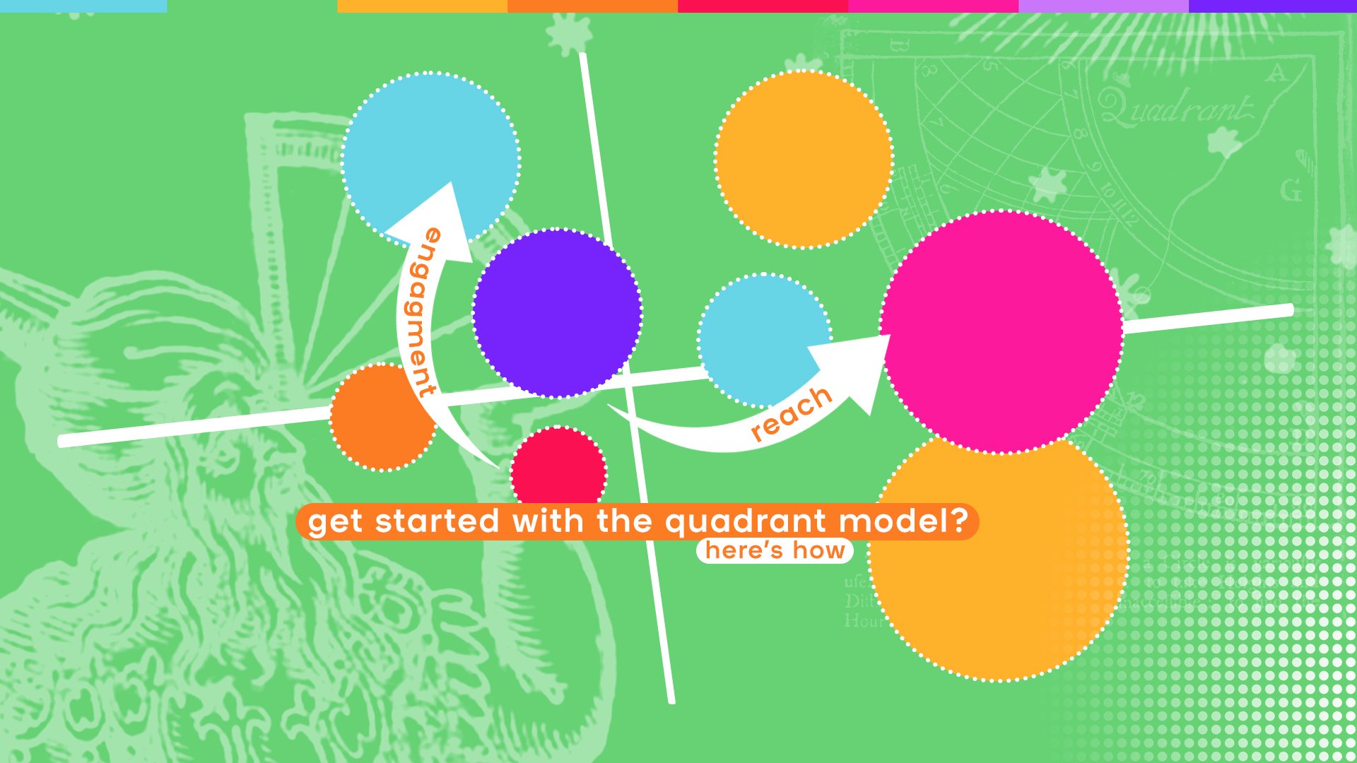
Want to get started with the Quadrant Model? Here’s how
Sept. 26, 2022 by Em Kuntze
Over time, what’s happening with your content? Are things going in the right direction? That’s it, really.

Erik van Heeswijk CEO and Co-founder @ smartocto
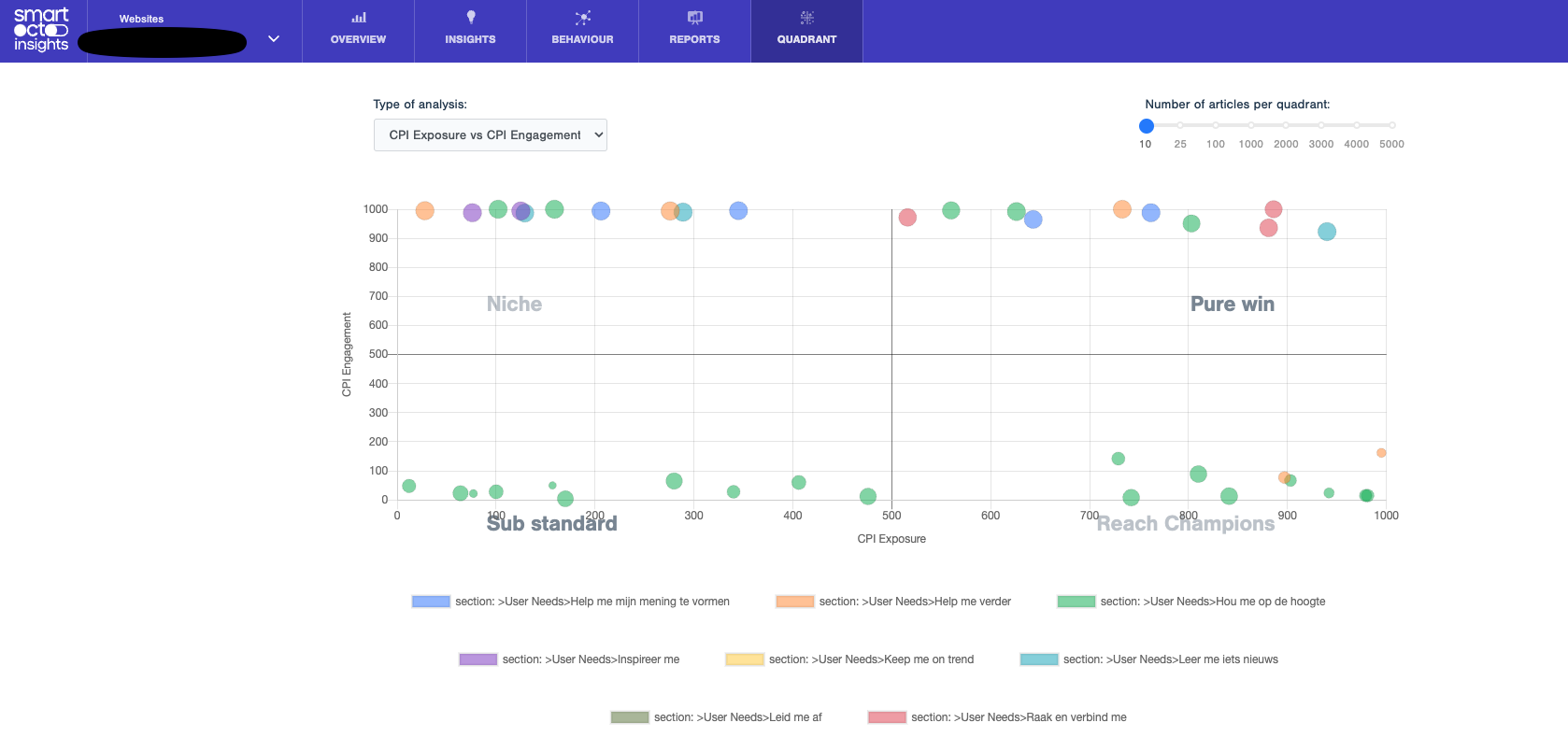
As the name suggests, you can see how your content is performing by where it’s positioned in a quadrant. You select what the axes represent, so there’s a degree of customisation available and you can ensure that this analysis does what your newsroom needs it to.
If you choose engagement and reach, for example, things might look like this:
- After publication, articles appearing in the bottom left quadrant score badly for engagement and reach, and would be considered a NO-GO area. Analysing why it’s not good enough is very important.
- Consider if it is a topic you believe is relevant for your brand and audience. You need all the effort available to get your audience connected, because the audience isn’t connected at all, based on the results..
- On the top left is where you’ll find articles which score highly for engagement but not for reach: these are considered niche articles. They’re successful in terms of engagement, but not in terms of reach.
- Consider: is your distribution in order: not all articles are destined for anything other than a niche audience, and that’s fine. But that won’t be true all the time. Some of these articles can be improved by giving them better opportunities to be read: on social, on your home page, in your newsletter. Or with just better timing!
- Gold standard articles appear in the top right section
- Time for some analysis: what makes these articles so successful? Could you present it in a newsletter, on social media or perhaps make a follow up?
- Bottom right are reach champions. They’ve been read by a lot of people, but don’t score high for engagement.
- Consider: Are they a bit too clickbait-y? Is the headline somehow misleading?
- Often these articles need enrichment: could they benefit from infographics or video? Or a different perspective? You know we really like the possibilities of User Needs.
A quick note on its development
The Quadrant Model is basically a visualisation of the page performance indicated by smartocto Insights. It gives editors a view of what works for their audience and what does not.
Belgium publisher DPG Media uses a quadrant Model for strategic reasons. Their goal is to convert more visitors to a premium membership. We at smartocto were inspired by the joint collaboration on this subject and created a more generic version of the Quadrant Model.
- There’s a sliding scale to enable you to include fewer or more articles in the analysis. So, you might elect to see just 10 in each quadrant, or hundreds. As to how these are selected, it’s done by most extreme to highlight outliers. Necessarily the further down this list you go, the more likely you are to see dots appearing in the middle of the quadrant.
- The size of the balls on the diagram mean degree of loyalty. That’s the 1.0 version. This might change in the future. You could also arrange it so the size of the balls represents the number of articles of that type (be it organised by user need or topic etc).
- You can see which authors bring the reach, who brings the loyalty.
- You can click on a dot and drill down to see how that individual article is performing - and how it has performed.
So what can it do? And, how do you actually use it?
Erik has outlined six strategies, all of which are currently in use by the newsrooms that are testing the Quadrant Model. These are the six strategies:
STRATEGY #1: MORE OF THAT
Whatever is in the right top section is doing pretty well. If there are topics in there that you’re not serving out on a regular basis, you should rethink that: clearly readers like them.
STRATEGY #2: DISTRIBUTE OR ENRICH?
Left top quadrant articles might need some further thought about distribution (place in Facebook, newsletter, homepage etc), while those in the bottom right need enriching somehow (think video, infographics etc).
STRATEGY #3: CHECK YOUR PAYWALL STRATEGY
If you select free and paid articles and see which quadrants they’re in, you can learn a lot about your paywall strategy. Are there paid articles which are surprising reach winners? What is the pattern in that? Are there free articles which are too niche to play a big part in the open domain? Maybe they’re better suited to serve your paying subscribers and reduce churn? (And, by the way: the quadrant also shows loyalty which correlates with conversions).
STRATEGY #4: CHECK YOUR USER NEEDS FOR NEWS FORMULA
If you select the User Needs as filters, and select a lot of articles, the colours will show you the role your user needs formats play in your content strategy. Which formats should you use, when you want more reach or more engagement, for example?
STRATEGY #5: TRAIN THE EDITOR
If you select authors, you can see which authors are crushing it, and which still need to win on impact or need to enrich their articles. Depending on the topic of course.
STRATEGY #6: JUST STOP
Whatever topic is continuously in the Basement (left bottom), produce less of that to save valuable editorial time that you can use for other quadrants.
There’s no learning curve for this: you just need to find the strategy you want to implement and go from there.

Dragutin Miletić CTO and Co-founder @ smartocto
So there you have it. How will you use it in your newsroom?